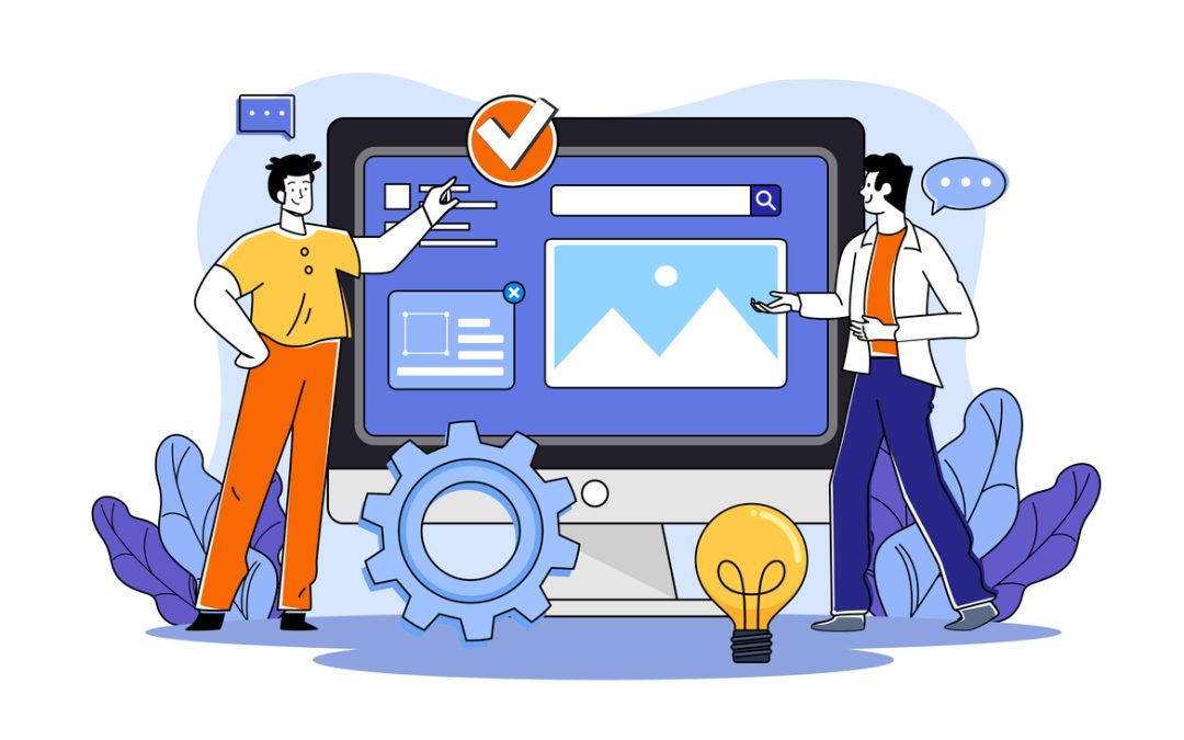
What IS Responsive Website design?
There is a LOT more talk about making your website ‘responsive’, especially after Google recently said it is optimising specifically for small screens like Mobile phones, iPads and Tablets
But what does that really mean?
The key thing you need to remember is that you do need to ensure that your website looks good …AND is easy to navigate around on smartphones and tablets..NOT just desktops & laptops
Overall, responsive web design is essential for:
- delivering a consistent user-friendly experience across devices
- improving search engine visibility
- saving time and cost
- future-proofing your website
- increasing conversion rates.
In today’s mobile-driven world, it has become best and standard practice for building successful websites.
Why IS responsive site design important?
Let’s drill down!
Responsive web design is important for several reasons:
- Mobile usage: With the increasing use of smartphones and tablets, it has become essential for websites to provide a good user experience across different devices and screen sizes.
Responsive web design ensures that your website adapts and displays properly on various devices, improving usability and accessibility for mobile users. - UX (User Experience): Responsive design focuses on delivering an optimal user experience regardless of the device being used
It ensures that content is easily readable, images are appropriately sized, and navigation is user-friendly. By providing a seamless and consistent experience, you enhance user satisfaction, engagement, and the likelihood of visitors staying on your website. - SEO benefits: Responsive design is preferred by search engines like Google.
Google recommends responsive web design as it simplifies website management and helps ensure that content is accessible to both desktop and mobile users.
Responsive sites also avoid issues like duplicate content and provide a better user experience, which can positively impact search engine rankings. - Cost and time efficiency: Maintaining separate versions of a website for desktop and mobile can be time-consuming and costly.
Responsive design eliminates the need for creating and managing multiple versions of your site
By having a single website that adapts to different devices, you save development and maintenance efforts, streamlining your workflow. - Future-proofing: As new devices and screen sizes continue to emerge, responsive web design ensures that your website remains adaptable to future technologies. It provides a flexible foundation that can easily accommodate changes and updates, saving you from constantly redesigning and rebuilding your site to keep up with ever evolving devices.
- Increased conversion rates: A responsive website has a higher chance of converting visitors into customers or leads
By delivering a seamless experience, eliminating barriers to usability, and making it easier for users to interact with your site, responsive design can positively impact your conversion rates and business goals.No idea about website design? Book a Free 30 min call!
Updated July 23