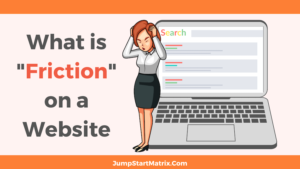
Friction on a website refers to any element or aspect in your site’s design that creates obstacles, confusion or frustration for visitors, hindering their ability to navigate, complete tasks, or achieve their goals
It represents the points of resistance or difficulty that users may encounter during their interaction with the website.
What are examples of friction on a website?
Friction can manifest in various forms, including:
Complex Navigation: If the website’s navigation structure is confusing, cluttered or lacks clear labelling, your visitors may struggle to find the information or features they need, leading to frustration and increased friction.
Lengthy Forms: Lengthy and complicated forms that require excessive input fields or ask for unnecessary information can deter users from completing the desired action, such as signing up for a service or making a purchase.
Poorly Designed User Interface: A cluttered or poorly designed user interface can overwhelm visitors, making it difficult for them to understand how to interact with the site or locate specific elements. Unclear buttons, confusing layouts, or inconsistent design patterns can all contribute to friction.
Slow Load Times: Website pages that take a long time to load can be frustrating for users, as they have to wait for content to appear.
Slow load times can lead to increased bounce rates and negatively impact user experience.
Lack of Mobile Optimisation: With the rise in mobile usage, websites that are not optimised for mobile devices can create friction.
Google is also “Mobile first” meaning how your site looks and works is judged on mobiles/ smaller screens NOT desktops.
If the site is not responsive or difficult to navigate on a smaller screen, users may struggle to access content or complete tasks, resulting in a poor UX (User Experience) Not good.
Intrusive elements: Excessive or intrusive elements/ads that disrupt the user’s ability to view or interact with the site’s content can create friction.
Pop-ups, auto-playing videos, or ads that cover the main content can frustrate visitors and diminish their overall experience.
They can be used- but must be handled with care.
An example of “Sign Up” friction on a site:
A great article specifically on Sign Up Flow & Friction from CXL:
Friction is “the psychological resistance that your visitors experience when trying to complete an action.” It’s also a conversion killer.
You can optimize your value proposition or call to action buttons all you want, but if your sign-up flow contains too much friction, you’re leaving money on the table.
Eliminating friction is one of the most effective ways of increasing conversions.
However, it’s difficult to identify sources of friction in your sign-up process if you’re just guessing.
Friction can occur anywhere on a site, but we’ll take a specific look at the sign-up flow, where much of it occurs.
What is a sign-up flow?
A sign-up flow is one key step in the user experience journey, where a new user first interacts with your product or brand. In this step, users sign up and create and account on your website or app.
Overall Site “Flow” is so important!
Friction and the sign-up flow
Friction measures how much effort the user has to exert to sign up. Though difficult to quantify because of variance and subjectivity, it can be measured using three factors (via Totango):
- Steps to completion. The number of steps or the series of pages that the user is expected to pass through.
- Information cost. The number of fields that a user has to fill up.
- Effort investment. The number of decisions the user must make, and the number of additional activities required (e.g., email confirmation, CAPTCHA, etc.)
There are a few ways to design a sign-up flow, and there are pros and cons to each. The goal, usually, is to reduce friction while maximizing revenue and users.”
Another older but relevant post discusses The Fogg theoretical model for content on Landing pages:
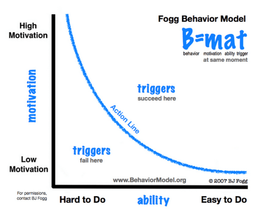
“Dr. B.J. Fogg, a professor at Stanford University and the founder of the Persuasive Technology Lab, developed a model to explain what influences behavior.
According to Fogg’s model, behavior occurs with the presence of three elements: motivation, ability and triggers.
When the expected behavior doesn’t take place, it means that one of the three elements is missing.
For instance, you may be highly motivated to eat organic foods, but if you only have access to Burger King for meals, it will be impossible to behave accordingly.
Or you may be triggered to turn on your television when you see the remote, but if the television doesn’t work, you’ll be disappointed when nothing happens.
When it comes to landing pages, the model can help identify where your visitors get tripped up along the way to performing a task – and ultimately, this insight can help improve conversions.”
Another older (but updated in 2020) useful post from user researchers Nielson Norman Group, with more on both Flow and Friction in site design:
“10 Usability Heuristics for User Interface Design“
Summary: Jakob Nielsen’s 10 general principles for interaction design.
They are called “heuristics” because they are broad rules of thumb and not specific usability guidelines.”
My Note: “heuristic” adjective
1.enabling someone to discover or learn something for themselves….”a ‘hands-on’ or interactive heuristic approach to learning”
2.Computing -proceeding to a solution by trial and error or by rules that are only loosely defined.
No idea about Friction? Book a Free call today!
Do you know IF your site has “Flow” or “friction”?
We can help.
JumpStart specialises in strategy consulting and DDDM (Data Based Decision Making) and we perform a range of Site Audits!