The Footer Menu serves as a navigational element that appears at the bottom of your site’s page(s).
It provides users with easy access to important links and information.
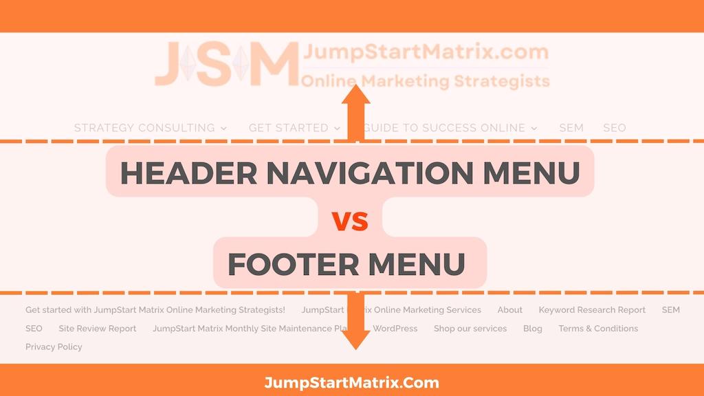
What are the differences between Footer and Header Navigation Menus?
The Footer Menu and the Header Navigation Menu serve different purposes on a website, but they should maintain a certain level of consistency to provide a cohesive user experience.
While they can have some differences, it’s generally recommended to maintain a degree of similarity between the two.
Structural consistency:
The Footer Menu should align with the Header Navigation Menu.
This helps users easily locate the information they need, regardless of where they are on the website.
For example, if the main navigation menu has dropdown submenus, it’s a good practice to replicate this structure in the Footer menu as well.
Differentiate priority:
The Header Navigation Menu often takes priority in terms of visibility and emphasis, as it’s typically the primary way users navigate the website.
Remember, the Header Navigation Menu can play a role in how Google crawls and indexes your website.
Google’s crawlers analyse the text content of your web pages from the top to the bottom, to understand their context and relevance for search queries.
The Footer menu, on the other hand, is more of a secondary navigation element.
While it should maintain a consistent visual style with the header menu, it can be visually differentiated to avoid overshadowing the main navigation.
Additional content:
The Footer is a suitable place to include supplementary content that may not be present in the Header menu.
This can include links to privacy policy, terms of service, copyright information, sitemap, social media links, or other relevant resources.
The Footer menu allows users to easily access this information without cluttering the main navigation.
Core links:
Both menus should include core links that are essential for user navigation.
These are typically links to important sections of the website, such as Home, About Us, Products/Services, Contact, or any other primary sections that are relevant to your website.
Consistency in core links helps users quickly find key information regardless of their location on the page.
The Footer menu generally includes links that are more related to ‘secondary’ pages or additional information.
Responsive design:
Both the Header Navigation Menu and the Footer Menu should respond well to different screen sizes and devices.
Ensure that they remain accessible and user-friendly on desktops, laptops, tablets, and mobile devices.
(Remember- Google is now “Mobile First” so people’s experience on a small screen takes priority over the Desktop ‘view’)
No idea about designing Menus? Book a Free Call!
What is best practice for designing and implementing a Footer Menu?
Use clear and descriptive labels/ naming: Ensure that the labels for each link in the footer menu are concise, descriptive, and easily understandable.
Avoid using jargon or ambiguous terms that could confuse users.
For example, instead of “Services,” use specific labels like “Workshops” “Products,” “About Us,” or “Contact.”
Group related links: Organize links into logical groups or categories
This helps users quickly find what they’re looking for and improves the overall usability of the footer.
For example, you could group links for “Support,” “FAQs,” and “Help Center” under a “Customer Support” category.
Keep it concise: The footer menu should be a streamlined version of the main navigation menu.
Prioritise important links: Place the most critical links at the beginning of the footer menu.
These may include contact information, terms of service, privacy policy, and copyright information. Consider the needs of your target audience and what they are most likely to look for in the footer.
Hubspot says:
“It’s important to understand that the only requirement for designing a great website footer is knowing what your visitors are looking for.
That’s why there’s no precise recipe for a website footer.
There’s some standard ingredients but what exactly you put in, the amount, the order — it’s up to you” eg
-
- Copyright Notice
- Privacy Policy Link
- Sitemap
- Logo
- Contact Information
- Social Media Icons
- Email Sign-up Form”
Recap:
Provide contact information: Include essential contact details like email address, phone number, and social media links in the footer.
This helps your visitors easily reach out to you or connect with your brand on various platforms.
Make it responsive: Ensure that the footer menu is responsive and adjusts well to different screen sizes and devices. It should remain accessible and legible on desktops, laptops, tablets, and mobile devices.
Consider accessibility: Pay attention to accessibility guidelines when designing the footer menu.
Use proper colour contrast, provide alternative text for images and ensure that the links are keyboard accessible.
Link to important policies: Include links to your privacy policy, terms of service, and any other legal documents relevant to your website.
This helps build trust with users and demonstrates transparency.
Test and iterate: Regularly monitor user behaviour data and gather feedback to improve the Footer menu.
Always make changes based on DATA not random guesses or graphics whims.
A/B testing can help you determine the most effective layout and content for your specific audience.