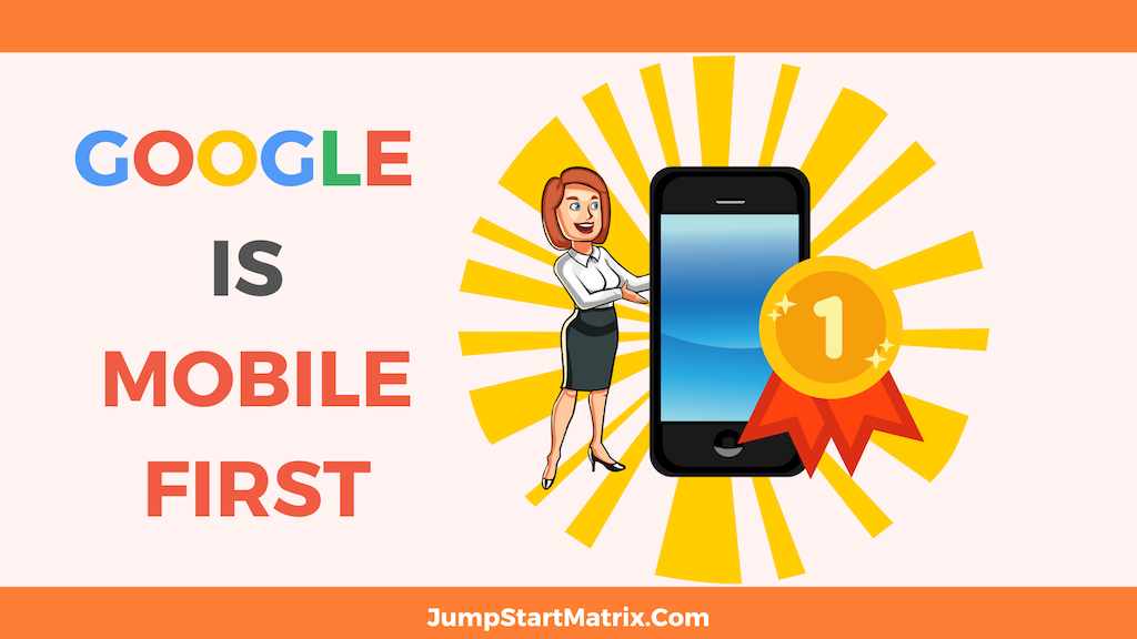
IF you haven’t heard (and I am often surprised by how many people that should know this do not) Google is Mobile first.
This means amongst other things, that Google is now looking at how your website performs on Mobile/ smaller screens as a ‘ranking signal’.
STOP looking at your site on your Desktop! Get out your phone….
Simply put, if your site is not ‘responsive’ ie automatically adjusting to fit the size of the device screen that your visitor is looking at the site on, then Google will mark your site down by showing your site lower on organic rankings on the SERPS ( Search Engine Results Pages)
This is clearly an unwelcome result for most businesses!
Adobe says “Mobile-first design is a design philosophy that aims to create better user experiences by beginning the design process with mobile devices in mind first, often prioritizing the smallest of screens”
Why mobile first?
“As mentioned, mobile internet use has outgrown desktop internet use.
If 72.5% of people will access the internet solely with their phones in 2025, this shows the importance of having an optimal mobile user experience.
Additionally, consumers are more likely to shop and return to businesses who have a mobile friendly site
Mobile first is content first
When designing for mobile first, you must remember that content is key.
Using a content-first approach, designers should give their users the content they absolutely need with nothing extra.
Anything additional might clutter and distract away from the mobile experience.”
JumpStart can help you identify where you are losing traction on Google- and lay out a clear plan of action to get your site reviewed and whipped into shape.
Need Help NOW?
JumpStart also has Content Creation Packages that can be tailored for your business!
Contact us for more information today
Does your business need help to get brand Confidence & Trust up – and be found in all the right channels online? No Problem!
Need Online Marketing Experts? Book that FREE Call Now!