SEM & SEO (Search Engine Marketing & Optimisation) for Mobile phones and Tablets is something a lot of people are confused about.
What is it?!
Google has moved requiring everyone with a website to have a site that performs well on a mobiles and tablets like iPads, as well as desktop computers, with one of their latest updates.
Google wants your site to load quickly (ie the time taken for data to show up on our screen) and resize to fit the smaller screens to be easily ‘navigated’ That is responsive design!
Why?
It turns out that we are all even more impatient on a mobile for things to load than we are on our desktops! We want sites to load in LESS THAN 7 SECONDS.
The “Visitor Experience” should be your Holy Grail too,not just Google’s!
No idea where to start? Book a Free call today!
Responsive Sites:
So, there are several different ways ensuring your site works well on smaller screens like mobiles can happen.
If you are one of the lucky few that have a relatively new website and a decent web designer/online marketer assisting you, you will probably already have a theme that is “responsive“
- If your site/theme is not responsive, your online marketer or web developer will have to assist you with some options like a new theme
- OR you will need to look at customising your current site’s landing pages to direct traffic to those responsive pages
- OR you will have to have to build a separate site for mobiles.
- IF you currently use WordPress for your site this is not hard , UNLESS your theme is already ‘customised’.
One thing you need to know is that your site can and probably will drop in ‘Organic’ rankings in the future ( if it hasn’t already!) if this is not done and will certainly suffer if you are using Google Adwords to advertise!
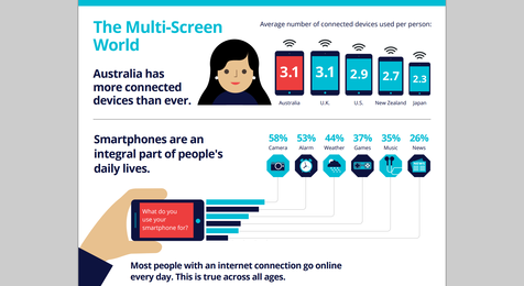
Here is a PDF to illustrate some of the reasons this is increasingly important:
Google_Infographic_consumer-barometer-insights-from-australia